The following chart is clear indication that responsive design is no longer optional. Mobile devices account for nearly 40% of all web traffic, up from 30% just a year ago.
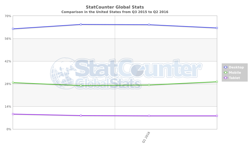
Source: StatCounter Global Stats – Platform Comparison Market Share
Websites Internet Marketing for Small Business and Non-Profit
The following chart is clear indication that responsive design is no longer optional. Mobile devices account for nearly 40% of all web traffic, up from 30% just a year ago.
Source: StatCounter Global Stats – Platform Comparison Market Share
For complete details, check out FROGware
Considerations and questions to ask about: Why Refresh and upgrade my website?
To be most effective a website should…
– Have Responsive Design
– Be Easy to Update
– Be set up for Content Marketing
– Have easy Social Integration and…
– Be based upon Affordable Effective design
If you are unsatisfied with your answer to any three of these items it is time to review and evaluate the effectiveness of your website.
If you are unsatisfied with your answers to any five or more of these items it is definitely time to refresh your website.
In either case your time would be well spent meeting with Frog Productions.
Free Website Stimulator visit. —-at no obligation Frog will provide an outline of what a website should do for a company like yours including specific suggestions for improvement. If we think that Frog Productions can help we will follow up with a written no obligation written proposal.
Hank Weber
Responsive Design senses the device type, screen size and orientation of the web site visitor’s mobile device and changes the web page layout to maximize the viewer’s readable experience.
The goal of responsive design is to build web pages that detect the visitor’s screen size and orientation and change the layout accordingly.
Responsive Theme is a flexible foundation with fluid grid system that adapts your website to mobile devices and the desktop or any other viewing environment
Responsive web design (RWD) is a web design approach aimed at crafting sites to provide an optimal viewing experience—easy reading and navigation with a minimum of resizing, panning, and scrolling—across a wide range of devices (from desktop computer monitors to mobile phones). If you are in the business of building and designing websites, you cannot ignore the fact that many people are going to be visiting your sites on their smart phones and tablets.
The Web and the mobile browsers remain one of the top ways that users interact with websites and if they have trouble on their smart phone, there is a good chance they are not coming back. In light of this, responsive web design could be the best solution. It offers more than just a simple mobile template; instead, your entire site layout is designed to be flexible enough to fit into any possible screen resolution.
But there are some facts you should keep in mind.
Load Time and Performance
Responsive websites are nearly identical in download size regardless of device or screen resolutions. This means, viewing a responsive website on a smaller screen and displaying less visible content or smaller-sized images, doesn’t mean that the site will load faster.
Complexity
Mobile devices and browsers will have to deal with a lot of content. Sites should be careful to avoid loading unneeded CSS, running specific scripts and download large images.
A good implementation is possible, but it also means more complexity than developing a fixed width desktop site.
Time and Money
Higher level of complexity means also higher development cost.
The days where a designer’s work is done with a simple mock-up in Photoshop is gone.
Designers, developers and clients have to work together even closer. Design changes by designers or clients can lead to a large amount of development time. A good workflow can help keep costs low.
How Responsive Design Works
When I use the word “responsive” in terms of web design I mean that the entire layout responds based on the user’s screen resolution. Imagine this scenario: you’re reading a website on one tablet, then you switch to another device for one reason or another. The browser window is now re-sized. A responsive web design layout will feature schemes and a layout that gracefully breaks down and reinvents itself. From a usability perspective this is a brilliant technique.
Why Design for Mobile?
It has become evident that more users are going mobile, and not just for on-the-go web browsing either. Tablet PCs have begun to change in context when users are online in the classroom. Designing for mobile is certainly a requirement in modern day web standards. The only problem is choosing your method of development, and targeting your audience appropriately.
When you start coding for specific screen resolutions you end up with too many stylesheets to deal with. Media queries in CSS3 can be used to build iPhone-specific layouts for both portrait and landscape view. Since you can predetermine the pixel density it’s easy to revamp any HTML template for mobile.
Dynamic Image Scaling
Images are another important facet of practically every website. Mobile users may not be looking to stream videos, but photos are a whole different story. These are also the biggest culprits when it comes to layouts breaking out of the box model.
The standard rule for CSS is to apply a max-width property to all images. Since they’ll always be set at 100% you will never notice distortions.
Hank Weber
